
7 elements of a landing page that actually sells
Many people assume a good-looking landing page will bring in orders on its own. It usually doesn’t. Whether visitors stay or leave depends on how well the page guides them. Here are 7 elements almost every landing page that sells well has — with examples for a restaurant, a spa, or a homestay.
1. The top of the page must say what the visitor gets
This is what visitors see before they scroll. You have only a few seconds for them to grasp what this is and whether it fits them. A vague headline like “All-in-one business solution” says almost nothing.
Say plainly what the visitor gets. A homestay could open with: “Sea-view rooms, 24/7 check-in, book directly with no middleman.”
- A headline that states a concrete benefit.
- A short line on how you deliver it.
- A contact or booking button visible without scrolling.
The top of the page: a benefit headline and an action button visible on load.
2. Give the visitor a reason to choose you
Among you and a dozen others, why should they pick you? Don’t list features dryly. Turn them into a benefit the visitor can feel. Not “loads under 1 second”, but “visitors don’t wait, don’t drop off halfway — you keep the order”.
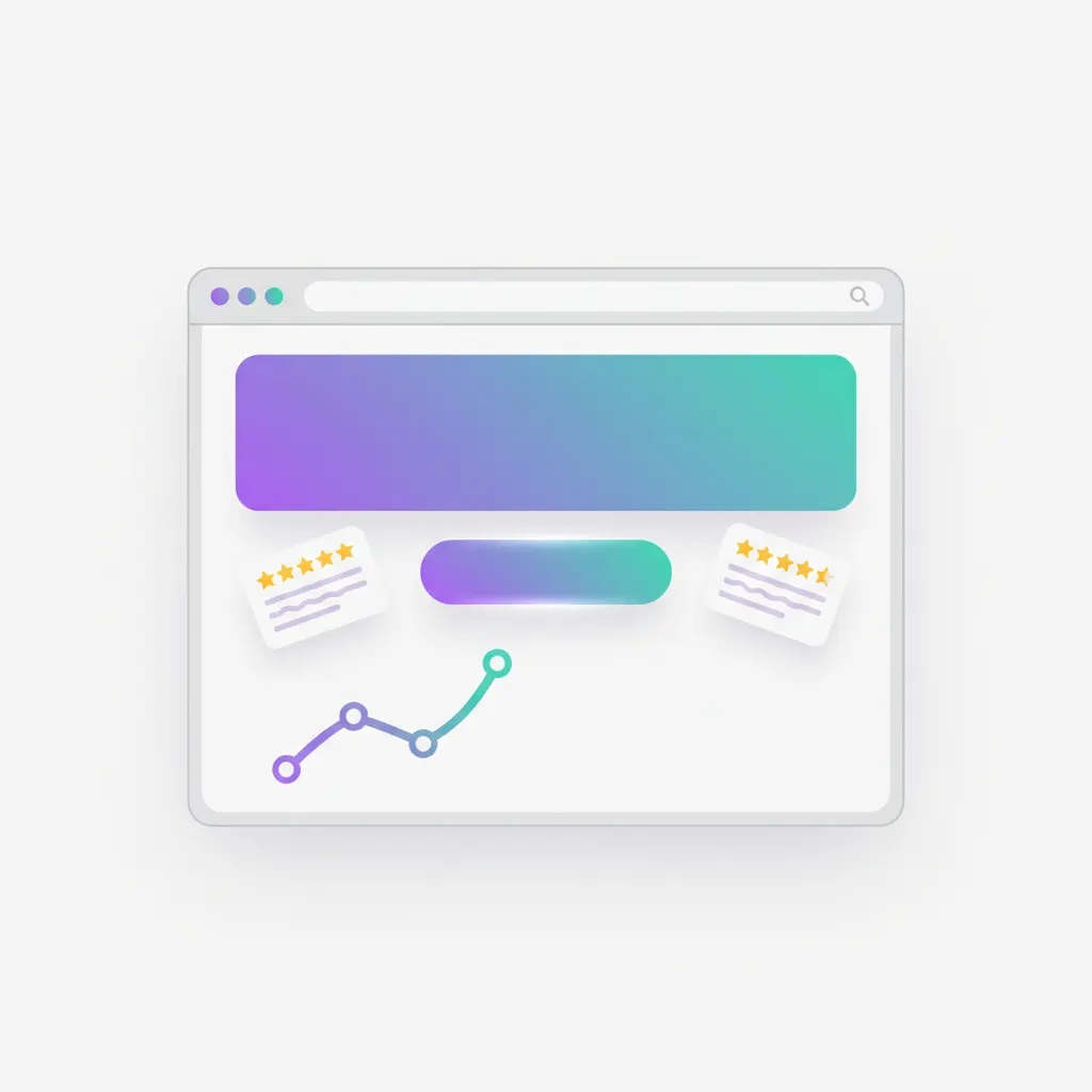
3. Show proof so visitors trust you
People trust earlier buyers more than your own praise. Show reviews from past customers, screenshots of thank-you messages, a few real numbers, or logos of places you’ve worked with.
4. A clear call-to-action, repeated
Each landing page should have one main thing you want visitors to do: call, message on Zalo, or leave a number. Place that button at the top, middle, and bottom so they can act the moment they’re ready. The button text should spell out the benefit: “Get a quote in 24h” beats “Submit”.
5. Clear doubts before the visitor asks
Visitors always have reasons to hesitate: how much, how long, what if I don’t like it. A short FAQ plus a few clear guarantees (warranty, design approval before any deposit) untie exactly those knots.
6. The page must load fast
This is the invisible element that hits revenue directly. Visitors on phones have little patience — one or two extra seconds and a share of them leaves. A light page that shows content quickly without jumping around is the baseline, not a nice-to-have.
7. Keep the contact form short
The more required fields, the fewer people fill them. Ask only what you truly need — usually a name and a phone or Zalo. Add a quick-call and Zalo button so visitors reach you with a single tap on their phone.