
What “above the fold” means — and why the first 5 seconds decide everything
Most of your visitors open your site on a phone, and for the first 5 seconds they see exactly one screenful — no scrolling, no tapping yet. That single frame decides whether they keep reading or go back to Facebook. This article is about how to lay out that first screen, the part web people call “above the fold”.
What “above the fold” means, in plain words
Above the fold is the part of a page visitors see the moment it opens, before they scroll. The phrase comes from print newspapers: folded in half on a newsstand, only the top half shows, so the biggest story always goes above the fold. A web page works the same way — except the “fold” is the bottom edge of a phone screen.
On a desktop that frame is roomy. On a phone — where most of your customers actually are — it’s tiny: one photo, a few lines of text, and one button, and you’re out of space. With real estate that scarce, you have to be picky about what earns a spot there and what moves below.
The first screen is your storefront: one glance and people decide to walk in or walk past.
The first screen must answer 3 questions
Visitors arrive with one thing on their mind: “is there anything here for me?”. If the first screen answers these three questions, they scroll on. If not, they leave:
- What do you sell? — one headline that names the product or service, no poetry.
- Who is it for? — the reader should think “ah, this is exactly for me”.
- What do I do next? — one clear button: message on Zalo, call now, see prices.
A spa could write: “Postnatal skincare for new moms in Da Nang” with a “Message us on Zalo to book” button. One line answers all three: skincare, for new moms in Da Nang, tap here to book. Compare that with a headline like “Where beauty blossoms” — after reading it you still know nothing. And don’t count on visitors scrolling down to figure it out themselves. They’re not that patient.
What a good first screen looks like
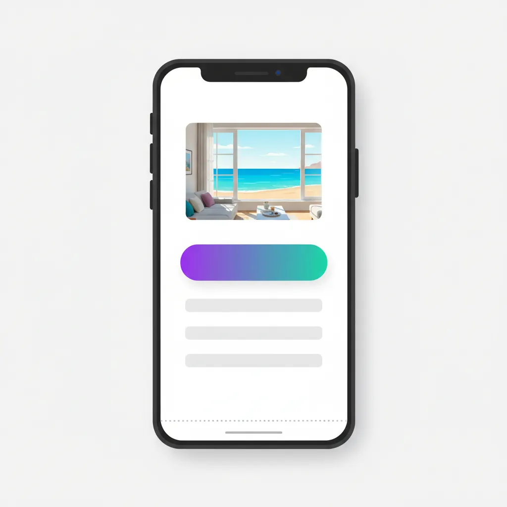
Take a sea-view homestay. A good first screen needs just three things: one real photo of a room looking straight out at the water, one line — “Sea-view homestay right on An Bang beach, from 550k/night” — and one button: “Message on Zalo to hold a room”. Before the 5 seconds are up, the visitor already knows how nice the room is, roughly what it costs, and where to tap.
Now the bad version, which I see all the time: same homestay, but the top of the page is a slider — an auto-rotating strip of photos — five or six images gliding past, each with a line of white text laid over a bright sky, impossible to read. The slider is heavy too, so for the first three seconds there’s just a gray box with a spinner. Five seconds gone, and the visitor still hasn’t seen a room or a price. One best photo plus one clear line plus one button beats a slider almost every time.
The most common first-screen mistakes
A huge banner with no button. A restaurant fills the whole screen with its grand-opening banner. The food photo looks great, but someone who wants to book a table has nothing to tap — the phone number sits at the very bottom of the page. Pretty but leading nowhere is like a flyer that forgot to print the phone number.
Text too small on phones. The page was approved on a desktop monitor where it looks fine, but squeezed onto a 6-inch screen the headline turns microscopic and visitors have to pinch-zoom to read it. In my experience, the moment someone has to zoom, they’re halfway out the door.
Logo and slogan eating half the screen. Owners love their logo, so it goes up big, slogan underneath — and half of the first frame is gone. But a logo is there for your pride, not for selling. Visitors need to know what they get, not admire a large logo. A small corner at the top is plenty.
The 5-second test you can run right now
Find someone who has never seen the page — your spouse, a nephew, anyone — and have them open it on their own phone. Give them exactly 5 seconds, then have them put the phone face down and ask three questions: what does this place sell, who is it for, and where do you tap to get in touch. Three smooth answers means your first screen works. Any hesitation tells you exactly what to fix.
And test on 4G, not your home Wi-Fi. If your images are heavy, a visitor on a weak connection spends those first 5 seconds staring at a blank screen — and then no layout, however clever, matters at all.