
A restaurant landing page: one page is enough — done right
I’ve met plenty of restaurant owners who paid for a full website — homepage, about page, news section — only to watch visitors open the menu and leave. The truth is a restaurant doesn’t need a multi-page website. It needs one page done really well. Here’s exactly what belongs on that page, with a real example: Pho Deli.
Why do people open a restaurant’s website?
Picture your customer: hungry, phone in hand, standing on the street or lying on the couch deciding what to eat tonight. They have no patience for a “brand story”. They just want four answers: what do you serve, how much does it cost, where are you, and are you open right now. A page that answers all four in one scroll wins.
People open a restaurant’s website for four answers: what’s on the menu, what it costs, where you are, and whether you’re open.
That’s why a restaurant landing page — a single page you scroll top to bottom — usually beats a multi-page site. There’s nowhere to get lost, and everything important sits within thumb’s reach. Here are the five things that page must have.
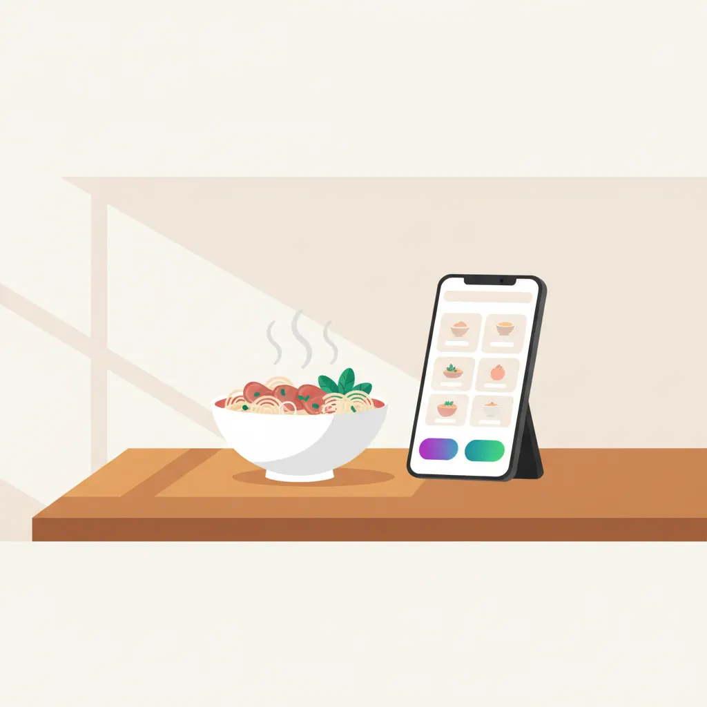
1. Real photos of your own food, shot properly
Photos sell harder than anything else on a restaurant page — and they’re the easiest thing to get wrong. The worst mistake is using stock photos from the internet: the bowl in the picture steams beautifully, then the customer arrives and gets something entirely different. That feeling of being tricked is hard to undo, and people tell their friends. Every photo on the page should be your actual food.
You don’t need to hire a photographer on day one. A recent phone, daylight next to a window, the dish fresh from the kitchen and still steaming — that’s enough. Five to seven careful shots of your best sellers beat thirty rushed ones.
2. A short menu with your signature dishes and prices
Don’t dump your entire 60-item menu onto the page. On a phone screen nobody scrolls through all of it, and too many options make deciding harder. Pick your 8–10 best sellers, put your signature dish first, give each a small photo or a one-line description — and always show the price. If people want the full menu, a button can expand it right on the page.
Hiding prices is the mistake I see most often. Owners worry that showing prices will scare people off, but it works the other way around: when there’s no price, customers assume “probably expensive” or fear getting ripped off, and pick the place next door with clear prices. A price is information that helps people decide — not a weakness to cover up.
3. Call and directions buttons pinned to the bottom of the screen
On phones, keep two buttons fixed at the bottom of the screen: Call now and Directions. Tapping the first dials your restaurant. Tapping the second opens Google Maps with your location, ready to navigate. A hungry customer will not squint at a phone number inside an image or copy your address into a maps app — every extra step loses another person.
“Pinned to the bottom” means the buttons stay put no matter how far someone scrolls. The moment they decide “this place, tonight”, the button is already under their thumb.
4. Clear opening hours
It sounds trivial, but that one line of opening hours saves you countless “are you still open?” calls and saves customers a wasted trip. List the hours for each day, your day off, and any midday break. If you only serve mornings — like many pho places — or stay open late like a barbecue joint, say so explicitly. If holiday hours change, update the page right away.
5. Reviews from people who actually ate there
People trust previous customers more than your own praise. Pick three or four specific compliments — “rich broth, crispy spring rolls, food came out fast” — with the customer’s name, near the bottom of the page. If your Google rating is good, put the actual number and review count on the page. One real number is worth ten lines of self-introduction.
A real example: Pho Deli
Pho Deli is a page we built for a restaurant brand, and the whole thing revolves around one job: helping visitors book a table as fast as possible. The first screen shows the restaurant name and a booking button; the menu and brand story come below. Every food photo is compressed and only loads as you scroll to it, so the main content appears in under 1.5 seconds. The design was made for phone screens first, then scaled up to desktop.
The point I want you to take away: the page doesn’t need sub-pages or fancy effects. It needs to be fast, clear, and pointed at a single action. You can read the full Pho Deli case study in the related posts at the end of this article.
The three most common mistakes
- A PDF menu people have to download. Customers wait for a file, open it, then pinch-zoom around a tiny screen — many give up at the download step. A menu written as text right on the page is instantly readable, and when someone searches a dish name on Google, your page actually has a chance to show up.
- Blurry, backlit photos. If the dish is a dark blob with no color, people scroll past as if it weren’t there. Fewer photos that are sharp and bright beat many photos that are all dark.
- Hidden prices. Saying it once more because it’s the most common one: with no price shown, customers don’t assume “probably cheap” — they assume “probably expensive” and go somewhere else.