
What is a CTA? How to place a call-to-action button people actually tap
CTA stands for “call to action”. In plain words: it’s the button that tells your visitor what to do next — call, message on Zalo, book a slot. Your page can be beautiful and the copy can be great, but whether someone actually reaches out often comes down to this one button. In my experience, three things decide whether it gets tapped: the label, the placement, and how much it stands out. Let’s go through each, with examples for a restaurant, a homestay, and a spa.
What a CTA really is
A visitor reads your page, likes what they see, and reaches the moment they want to act — ask for a price, hold a room, book a table. The button is the bridge for that moment. If there’s no bridge, or it’s hard to spot, they turn around, and you lose someone who was ready to spend.
One thing to settle before we talk about the button itself: each page should have one main action you want visitors to take. For a pho restaurant, it’s calling to book a table. For a homestay, it’s messaging on Zalo to ask about free rooms. For a spa, it’s booking a session. If you want visitors to call, download a price list, and follow your fanpage all at once, most will pick the easiest option: doing nothing.
The label: reading it should tell me what I get
“Submit”, “Contact”, “Learn more” — these are as inviting as an unmarked door. What happens after I tap? Who calls me back, when, will I get spammed? The visitor doesn’t know, so the visitor hesitates.
“Message us on Zalo for a quote” beats “Submit” because it answers three questions in one line: what I do (message), where (Zalo), and what I get (a quote). When people can picture the outcome, tapping feels much lighter.
- Restaurant: “Call to book a table tonight” instead of “Contact us”.
- Homestay: “See rooms free this weekend” instead of “Send request”.
- Spa: “Book a herbal head massage” instead of “Register now”.
A simple test: cover the whole page except the button text. If that one line alone tells you what you’ll get after tapping, it passes. If you need the paragraph above it to make sense of it, the label isn’t clear enough yet.
The button label should answer one question on its own: what do I get when I tap?
Placement: the button must be there when the urge hits
The first button should be visible the moment the page opens, before any scrolling. People decide fast, and plenty never scroll at all — don’t hide your only button at the very bottom.
For a restaurant, nearly everyone browses on a phone, usually while hungry. Keep a “Call to book” button pinned to the bottom edge of the screen — it stays put no matter how far they scroll, so the moment the craving peaks, the button is right under their thumb. For food businesses, this is the button that earns its keep.
For a spa, visitors tend to read through the services one by one before deciding. So repeat the booking button after each service section. Someone who just finished reading about your herbal head massage is warmed up — make them scroll back to the top to find a button and a good share of them will drop off along the way.
For a homestay, the best spot is right below the room photos and the price table — where the visitor has just seen the things they care about most. A “Message on Zalo to hold a room” button there catches people at their warmest.
The general rule: every visitor is ready at a different moment. Wherever someone has just been convinced, a button should already be waiting.
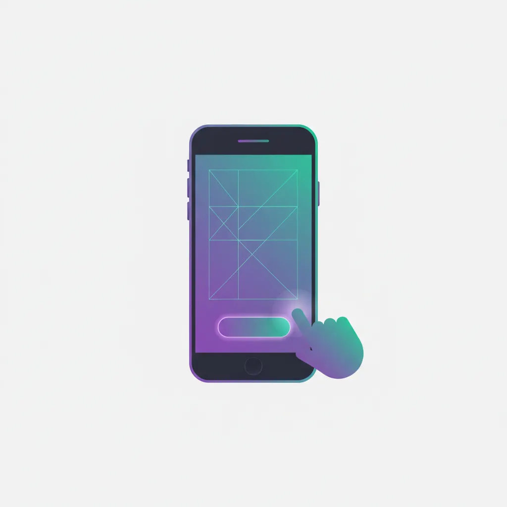
Prominence: the button has to look like a button
The mistake I see most often when reviewing pages: the button shares the same tone as the background and simply sinks. White background, grey text, pale grey button — at a glance it reads as decoration, and people scroll past without realizing it was tappable.
Give the main button a color that clearly breaks from the background, and reserve that color for the main action only. On a white or cream page, one orange or deep-teal button stands out on its own — no need to make it comically large.
- Big enough for a thumb on a phone, with breathing room around it.
- Secondary buttons (like “See prices”) get a thin outline and no fill — the main one always wins.
- Quick check: show the page to someone for 3 seconds and ask “where would you tap?”.
Two more mistakes that kill the tap
Mistake one: three buttons standing side by side. “Call now”, “Message on Zalo”, “Leave your details” — all the same size, all bold, all in a row. It feels generous, but a visitor who has to choose is a visitor who leaves. Pick one main action and make it the loudest; if you truly need a second path (say, a phone number for older customers), make it visibly smaller and quieter so the eye never has to decide.
Mistake two: making people fill out a questionnaire. They tap the button and get a form with six required fields — full name, email, address, occupation… — when all they wanted was to ask the price. Every extra field sheds another batch of people. A name and a phone or Zalo number is enough to start the conversation; ask for the rest after you’re actually talking.
One last test, and the simplest: take your own phone, play a customer in a hurry, and tap your way from landing to sent message. Wherever you feel lazy, your customers feel lazy at exactly the same spot.